

Terrarossa
An identity that reflects our essence.
Terrarossa is here, a place where nature meets hospitality. An accommodation immersed in the greenery of Crispiano, designed for those seeking peace and serenity.
Here we tell you the meaning behind our logo, which represents the essence of our project.
Logo
The name Terrarossa is a tribute to our land, its intense colour and its energy.
A land rich in history, traditions and deep ties with nature.
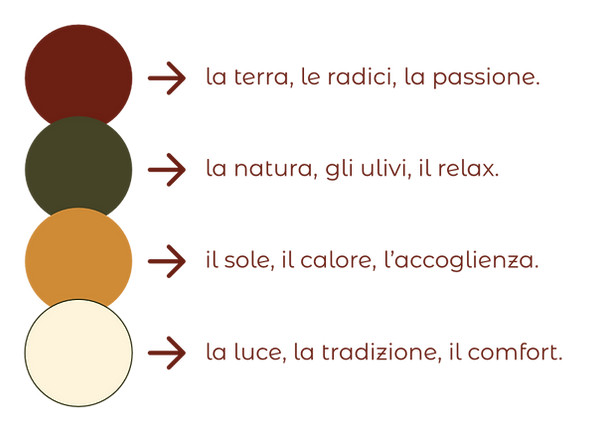
Each colour of our brand has a meaning:
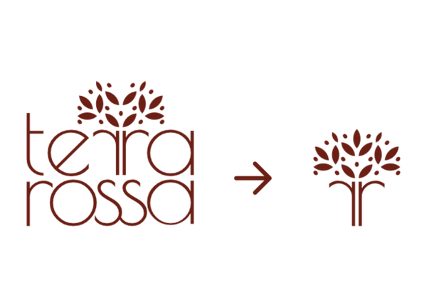
At the heart of our logo is an olive tree, a symbol of life, strength and connection with nature.
A tribute to the ancient olive trees surrounding Terrarossa, witnesses to history and beauty.
Terrarossa is more than just a stay: it's an experience.
Here time slows down, silence embraces every moment, and nature becomes the true protagonist.